What if our devices focused on empowering us instead of ensnaring us? What if limiting the capabilities of our electronics in specific and intentional ways could actually free us up to be more human? It’s questions like these that lie at the heart of Daylight’s entry into the space, kicking things off with their DC1 tablet. Let’s dive in together and inspect the DC1 from all sides to see if it lives up to the grand ideas of the Daylight team, how it’s shifted my expectations from my devices, and what it could mean for the future of computing.
Note: every word of this review has been written and edited on my DC1 and the Apple Magic Keyboard provided with my early adopter edition, which I purchased entirely on my own.
Unboxing
As an early adopter of the DC1 and one of the first to purchase it (with Bitcoin, no less!) the unboxing experience here is far from standard. I was lucky enough to be able to pick up my DC1 from the Daylight booth at the Bitcoin Conference in Nashville, giving me a couple of weeks to fully test it out in the rhythms of my daily life before writing up a full review. As an early adopter, my DC1 came pre-loaded with an alpha version of sol:os, the early-stage Android fork that the Daylight team has built to start shifting the software to better meet their vision for minimal distractions and maximal creativity.
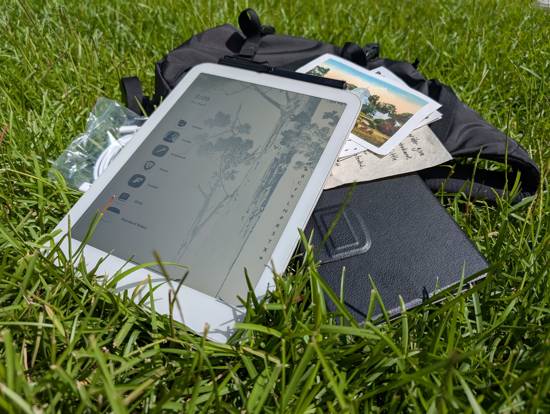
The DC1 came loaded in a Daylight-branded Patagonia backpack, a unique way to carry around just what you need to spend some time at a park or coffee shop patio (my workstation of choice) for a few hours to read, write, or draw. The backpack also had the standard paperwork, an Apple Magic keyboard (a stand-in for the forthcoming Daylight official keyboard attachment), a LAMY stylus, and charging cables for the tablet and keyboard. While this won’t be the standard unboxing experience for most people, it was an awesome touch and a positive first touch-point with the company overall.
My, oh my, that screen
I’ll skip straight to the punchline – the DC1 has the most powerfully different screen of any device I’ve ever used in my life. The moment I picked up the DC1 under the expo hall lights in Nashville and proceeded to use it and show it off to my team without any backlight turned on blew my mind. It’s impossible to properly convey the fluidity and impact of the using the DC1’s screen via text, but I’ll do my best.
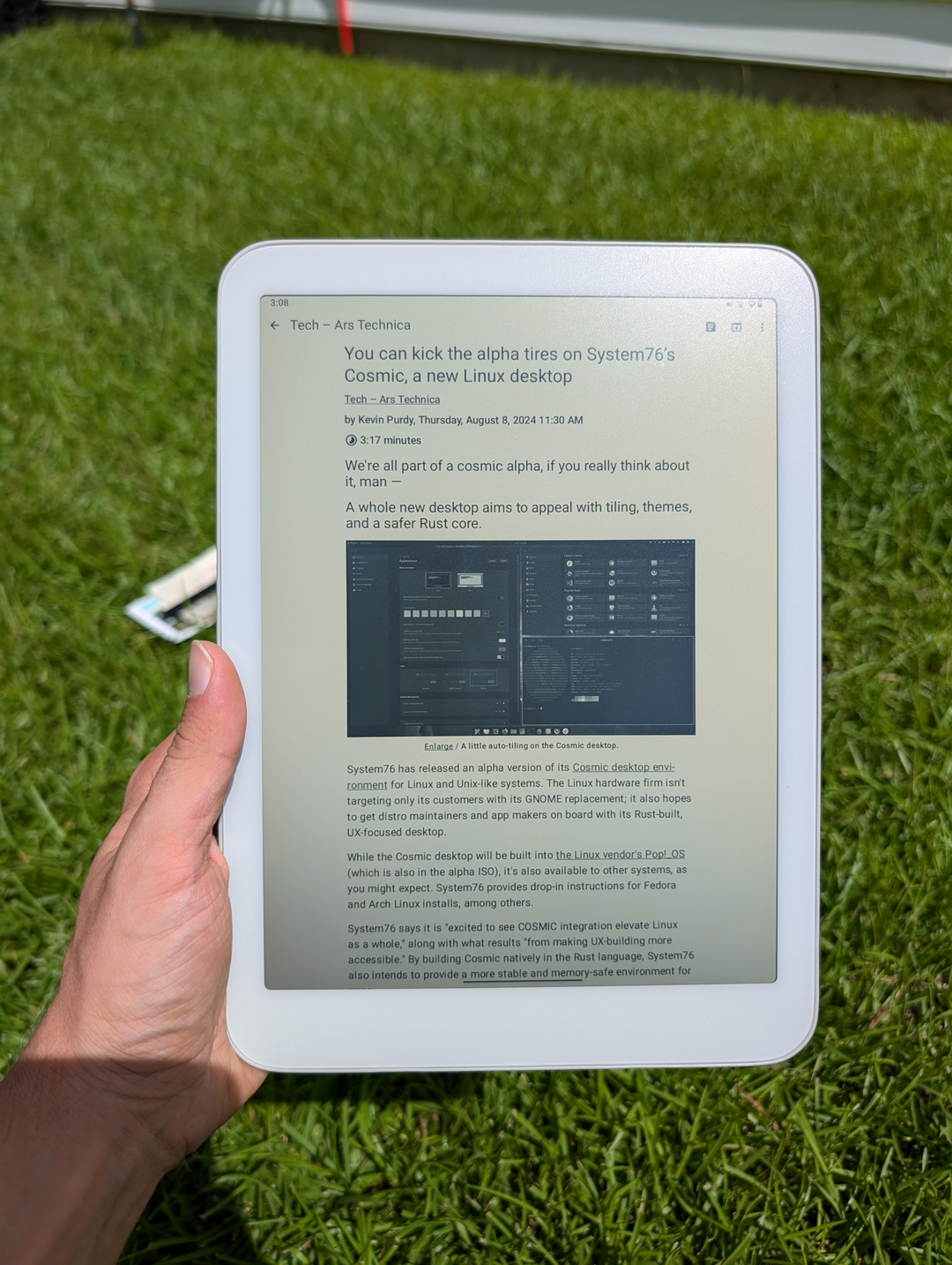
The Daylight DC1 takes a powerful new approach to displays, doing away with the gaudy colors and eye-searing brightness we’ve come to expect in modern devices and instead introducing a simpler, wildly more empowering display. The DC1 uses a black and white reflective LCD to offer the best of both worlds – sharp text, powerful outdoor usefulness, and a smooth 120hz refresh rate. The screen looks like a high-resolution e-ink screen, but the screen feels and responds like a top-of-the-line Android tablet screen.
The ability to just use the DC1 in bright daylight or a well lit room without any backlight is pure magic. I’ve found myself spending far more time outside reading and writing then ever before, as I can finally get a better view of what I’m doing outdoors than I can indoors on any other display. If you’re like me and value getting out to a good coffee shop, sitting at the park, or simply laying in the grass of your backyard while doing the things you love (not just reading books!) it’s quite simply a game changer.
Step inside or want to use the DC1 at night? You’ll often be surprised that the screen is usable even without a backlight with simple indoor lighting (I’m writing this sentence with merely a lamp on my nightstand as backlighting). But if it’s a bit too dim for that, Daylight has you covered – the DC1 has a unique backlight with two adjustments. You can change the brightness as you’re used to, but you can also adjust the coolness or warmth of the backlight to fit your preference. I much prefer the amber, no-blue-light backlight 100% of the time, but can quickly switch to the cooler backlight with a simple slider in the drop-down quick settings. The combination of reflective LCD with amber backlight means that between ambient light and backlight I never have to go above ~10% brightness.
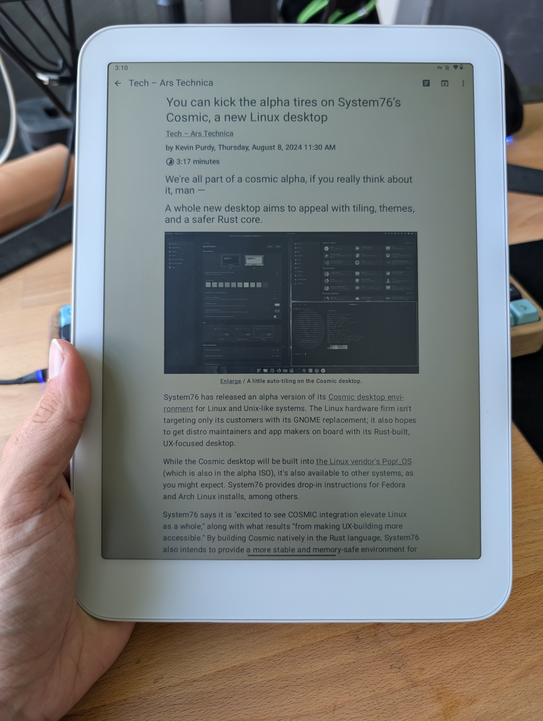
All in all, the DC1s display is literally unique – there is no other device in the world today that can boast the unique blend of usefulness for all types of creativity and learning. If you have the chance to see the DC1 in action, take it and see for yourself what I mean, as I still smile every time I turn on my DC1. It makes it far easier for me to use the DC1 as I need, engage in a healthy manner, and actually put it down when I’m done. Doom scrolling and falling down the YouTube rabbit holes are far less addictive with the lack of color, and I find myself yearning more to use it for consuming useful content and writing than anything else.
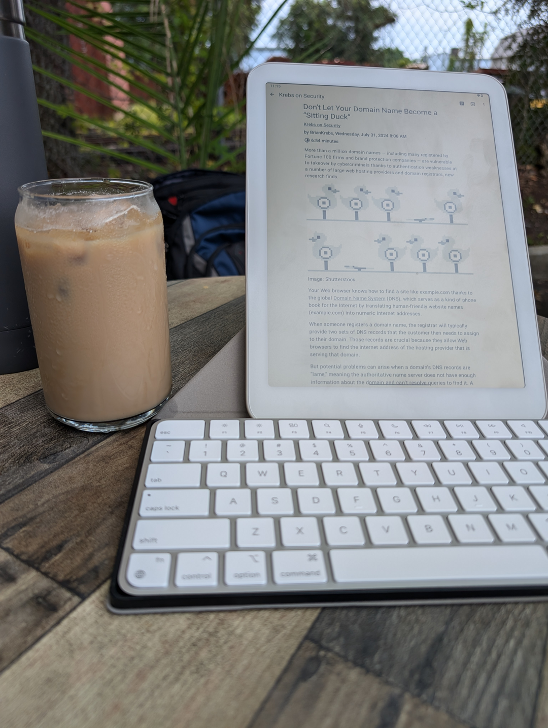
The other major aspect of the screen that has been immensely refreshing is the lack of blue light when using the amber backlight, as well as the flicker-free LCD technology used here. The combination of those two things has noticeably lowered my eye strain at the end of the day and led to less migraines as well. It’s a subtle difference if you’ve never tried something like well-made blue-light blocking glasses before (I wear a pair of Ra Optics glasses whenever I’m at my computer or watching TV), but it’s one that has a cumulative effect each day for sure.
Hardware
Having worked in the hardware space for the last two years with the Foundation team, I know first-hand how difficult it is to design, build, and supply everything necessary for a consumer device like this at relatively small scale. Suppliers don’t want to work with you, logistics are difficult, and prices are drastically higher than those a company like Samsung or Apple can get at their immense scale. All of this leads to it being very, very difficult to create a premium device (especially in a first attempt). This background makes it much easier for me to be a huge fan of the DC1 despite the imperfect hardware. The DC1 is about so much more than just being another Android tablet, so please keep reading after this section to learn why that is!
With the importance of the screen in this review, I’ve dedicated an entire section to talking about that. But a tablet has far more to it than “just” a screen! The DC1 has all of the basics you’d expect from an Android tablet, with none of the frills that come with the fancier offerings from companies like Samsung. The overall form factor is quite standard, with relatively large bezels that are useful for holding the device while reading or writing, no cameras at all (a win for privacy, and who the hell uses tablet cameras anyways!), and a standard set of power and volume rockers.
The overall feel of the tablet is fairly meh, which might be surprising given it’s higher than average price tag. The power button is a bit mushy on my unit, there is some minor creaking when you flex the back panel gripping the tablet tightly, and there are some less than ideal seams between the display glass and the plastic unibody shell. I’m not going to sugar coat it – this is clearly an “early adopter” tax that will have to be paid by those like me who are thrilled for the prospect of the DC1 and view the tradeoffs as well worth it. One aspect that I do really like about the tablet is the soft-touch plastic shell, something I miss from older phones and a pleasant break from the all-glass slippery sandwiches that much of the space has leaned into today.
The speakers are similarly meh, with relatively low volume output and tinny sound output out of the dual speakers on the bottom edge (around the USB-C port). This device is not about media consumption, however, so I’ve barely even tried to use the speakers anyways.
The main hardware differentiator outside of the screen is a set of two orange buttons, one on the right and top side each, that will be fully customizable down the line (I’m especially looking forward to using them as page turn buttons). For now, however, they just function as a back button with a single press and a shortcut to give feedback to the Daylight team with a double-press. There is also a set of pogo pins on the back that are yet to be utilized, but I expect they’ll be a key aspect of the keyboard attachment that’s in the works.
One last note to leave you with – I am not an artist by any stretch of the imagination, nor do I have good handwriting or normally use pen/pencil. Because of this, a large draw of the DC1 will go wildly underexplored in this review, as the DC1 is built around the concept of using it to draw and write with Wacom EMR passive styli. The DC1 even goes so far as to put a paper-like finish on the display to make it feel much more life-like when using the stylus, and that much I can confirm. Writing or drawing feels responsive and accurate, with proper palm rejection and support for fancier things like the button on my LAMY stylus acting as an eraser in the Reader app.
I have, however, had a few of my more artsy teammates at Foundation try it out while we were in Nashville and they had nothing but positive things to say about it, especially loving the the fact that it has the benefits of an e-ink screen while being wildly more responsive as you zoom and pan around a notepad. I’m sure someone else can dive into far more detail here, but I wanted to make it clear that that side of the DC1 is not my specialty!
Software
Similarly to the hardware side of things, the software on the DC1 is in it’s infancy and is by no means final. My tablet came loaded with an alpha build of sol:os as mentioned earlier, and that is what I’ve been using on my DC1 since I got the tablet. Overall, the software behaves similarly to any other Android 13-based tablet. You can install apps from the Play Store (sadly no sandboxed Google Play a la GrapheneOS yet), sideload APKs, leverage Obtainium or F-Droid, and generally access just about anything you’d expect. That is another of the massive advantages of the DC1, as you get the benefits of the screen from a device like a Kindle while still having the full functionality of an Android tablet.
Multitasking worked well in my usage, split-screen is effective (especially in landscape mode), and the tablet was quite performant. I wasn’t sure what to expect for performance, but overall I have been pleasantly surprised. The CPU keeps up easily with the high refresh rate display, apps live in the background properly, and everything responds fluidly.
The two unique aspects of sol:os today are it’s launcher and a unique new content reader app from Daylight simply called “Reader”. The launcher that comes pre-loaded with the DC1 is called Niagara and is a minimalistic launcher that fits well with the focus Daylight is taking. It gives a clean user experience, simplifies your home screen, and reduces distractions effectively. It closely mirrors a launcher I’ve long used on Android for similar reasons – OLauncher – as changing the launcher on your phone is an excellent first step towards digital minimalism.
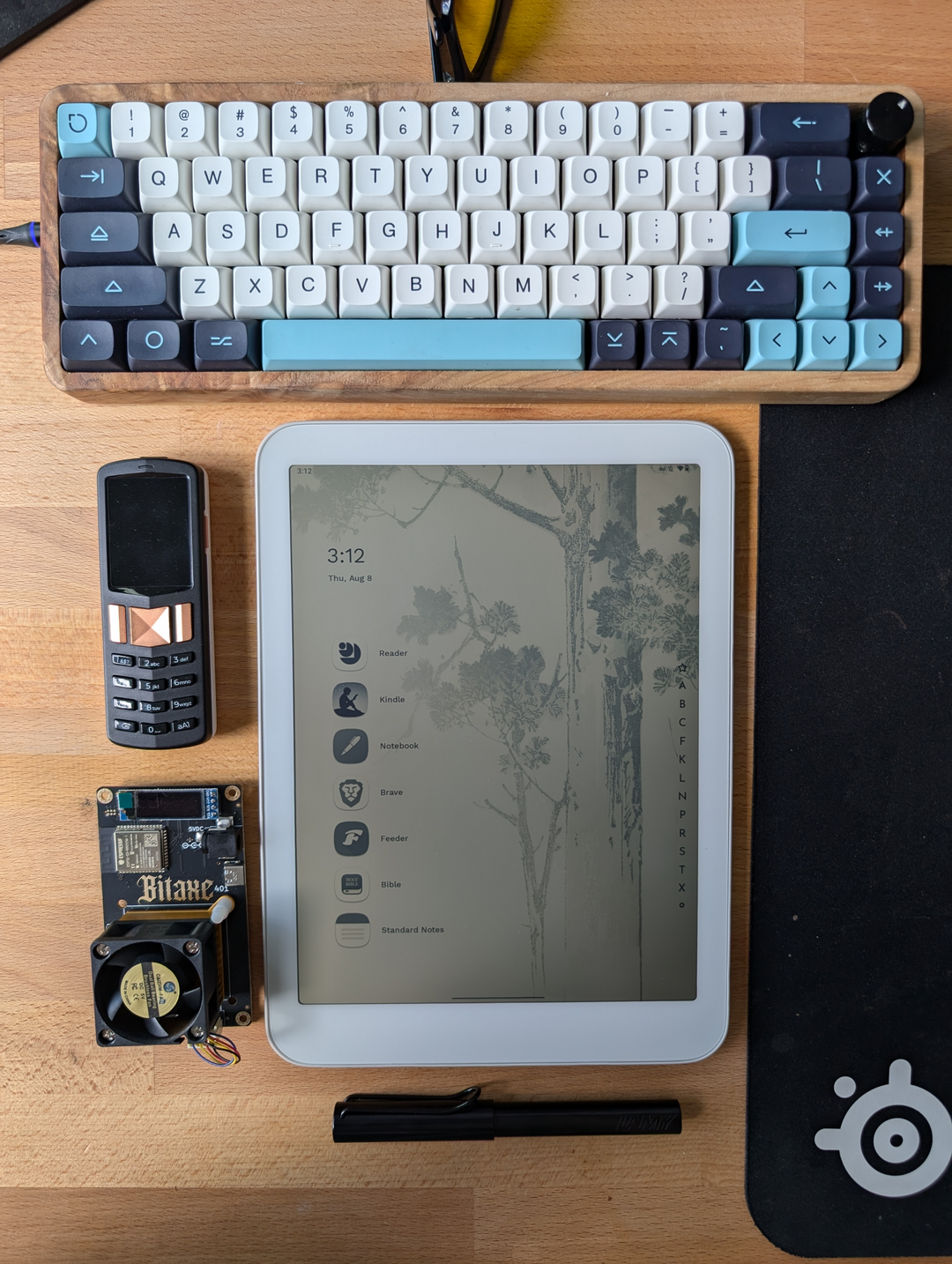
Reader allows you to easily send content to your Daylight from any Android or iOS phone or any browser, and Reader will download and save a local copy the next time you open the app on your DC1. This quickly became my go-to way to consume long-form content, and I find myself sending news articles, blog posts, and forum threads to my DC1 from my laptop throughout the day. It also functions as a PDF reader with good (if simple) markup functionality, making it much easier for me to keep up with the latest research in the cryptography, privacy, and cryptocurrency space. My only request for Reader? Add a page-turn navigation mode instead of just scrolling, so it’s more useful for consuming PDF ebooks!
It’s important to add here that Daylight does have long-term plans to greatly expand on their vision for the software side, including improving privacy (a la GrapheneOS), allowing you to easily switch between different modes (I.e. “create” and “play” with different apps and settings), and fine-tuning the Android experience in a way that better fits the display and ethos of Daylight.
One final note on the software – as the DC1 comes with a fork of AOSP out of the gate right now, it has the standard Android security and privacy model. Google Play Services are installed and deeply integrated out of the box, making it a poor choice for privacy at the moment. As mentioned above there are plans to improve this down the line, but for now I wanted to be sure readers are aware of the potential privacy concerns.
How I use the DC1
The primary focus for me in getting the DC1 was to have something that I could use to create and consume written content from anywhere, with a focus on outside usage. As such, my setup is pretty standard:
- Reading RSS feeds with Feeder
- I’ve switched pretty much all of my news and educational consumption to RSS feeds, forgoing doom scrolling on X or Nostr to focus more on long-form content. There is a serious RSS revival going on right now, and I am here for it.
- Reading ebooks with Kindle, Libby, or Lithium
- The DC1 is an amazing ebook reader, and that has been the primary recreational use I’ve found for it so far. Super easy to use, the screen works incredibly both indoors and out, etc.
- Reading scholarly journals and research papers
- I try my best to keep up with the cryptography, cryptocurrency, and privacy scene from a technical perspective, and the Reader app on the DC1 is perfect for this use-case as I mentioned above. Simple PDF reader that I can easily share to from any other device with mark-up functionality and a stylus makes this a perfect fit.
- Work and personal chats
- I’m trying to take a different approach here, keeping notifications entirely disabled on my DC1 as they come out of the box. Instead of using notifications, I get important ones on my phone and then spend some time each morning/evening replying to chats that I didn’t have the chance to get to during the day from my DC1.
- Writing via Standard Notes
- Standard Notes is an incredible e2ee notes app, with all the features I need for both personal notes and writing long-form content. As it has full Markdown support, I can easily write in Markdown on Standard Notes and just copy-paste to put up content on my blog or podcast site. Again, the DC1s ability to be used outdoors has already made me far more productive as I can enjoy the sunlight and wind while writing to my heart’s content.
- Light media consumption via NewPipe
- The lack of a color screen of course makes the DC1 a sub-optimal device for consuming content you want to be vivid and punchy, but it does still work quite well for catching up on conference talks or podcasts.
Conclusion
All in all, I have come away from my first two weeks using the same word every time I describe the DC1 to someone else – magical. The hardware and software shortcomings that come with being an extremely early adopter to a new category of technology are certainly here, but they’re dwarfed by the magnificence of the display and the new places and things it opens up to you. Daylight nailed what mattered – the screen – and have given themselves a chance to break into the market with something that is finally unique. I’ve been a tech enthusiast since I was a child, and it’s been a very long time since I’ve been this enamored with a piece of technology.
Is it perfect? No. Is it magical? Absolutely.